Ken’s Tech Tips graphically visualises how UK punters have been switching network and finds out who the winners and the losers are.
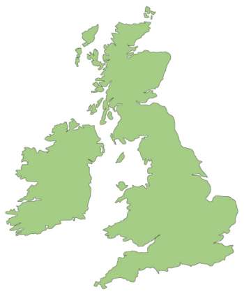 In this study, Ken’s Tech Tips polled more than 6,000 people over a 2 month period to find out how they’re switching mobile network. We’ve visualised this data to look at the net movement of customers from network to network. Our graphs show which networks are losing customers, which networks are gaining customers and where the customers are coming from.
Background Information
For this visualisation, we polled 6,145 people through our PAC Code Finder tool between October 20th 2010 and December 19th 2010 (the same data set used in our “Ken’s Tech Tips Index” study of network performance).
Respondents were asked to “select your current network provider and the network that you wish to move to” from a drop down menu of 9 mobile networks: 3 (Three), O2, Orange, T-Mobile, Vodafone, ASDA Mobile, Giffgaff, Tesco Mobile and Virgin Mobile. These 9 networks form our study.
From the 9 networks, we took each pair of networks in turn. We looked at the “net movement” of customers between each pair of networks and have visualised it in the graph below. For example, if 200 customers switch from Network A to Network B and 100 customers switch from Network B to Network A, the “net movement” of customers would be 100 customers from Network A to Network B. This would be represented by a line pointing from Network A to Network B in our visualisation.
 What is the Ken’s Tech Tips index?
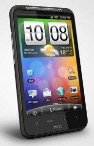 We love the HTC Desire HD for much the same reasons that we loved the HTC Desire. Both phones are well designed, are comfortable to hold and have a good build quality.
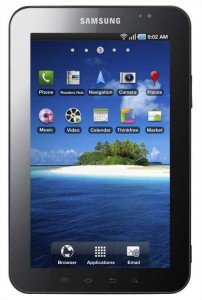 It might be a bit of an understatement to say that the technology enthusiasts across the world have been eagerly awaiting the launch of the Samsung Galaxy Tab and the chance to pit it against Apple’s iPad. Being the first Google-approved Android tablet on the market and the first mass-market 7-inch tablet device, the Tab gives us a taste of what might lies ahead in the tablet market and whether Android can take on the mighty Apple.